Nitpicking Hank Green's 4x3 Game
EDIT 7/6/26: Looks like Hank added a little settings menu with a bunch of accessibility toggles. What a champ!
I'm sure this isn't the first time I've mentioned, but I am a big fan of John + Hank Green. Hank Green, a prolific maker, released a new game rivaling the NYT's Connections called 4x3.
The distinction here is that, rather than 4 sets of 4 cards, this has 4 sets of cards, where all sets share one central card. As he succinctly wrote, "Four categories. Three words each. One word is in all four."
As a frontend engineer that has been building with AI, I see some Claude-y nits that I wanted to highlight. Not trying to be a hater and this is unsolicited critique. But, in a prompt driven world, education is the new barrier to accessible and quality products, so I'm sharing some things that you may not know that you can prompt for.
1. Muddy gradients
It looks like Hank is having fun with color here. It's a core part of the game, where yellow is most "straightforward" and purple represents increasingly "tricky" sets. In 4x3, since one card spans multiple sets, there's a need to visually represent the shared card across multiple colors.
background: conic-gradient(
  from 184.86deg,
  rgb(177, 201, 247) -45deg,
  rgb(179, 220, 192)   0deg,
  rgb(210, 185, 240)  45deg,
  rgb(243, 218, 142)  90deg,
  rgb(177, 201, 247) 135deg,
  rgb(179, 220, 192) 180deg,
  rgb(210, 185, 240) 225deg,
  rgb(243, 218, 142) 270deg,
  rgb(177, 201, 247) 315deg,
  rgb(179, 220, 192) 360deg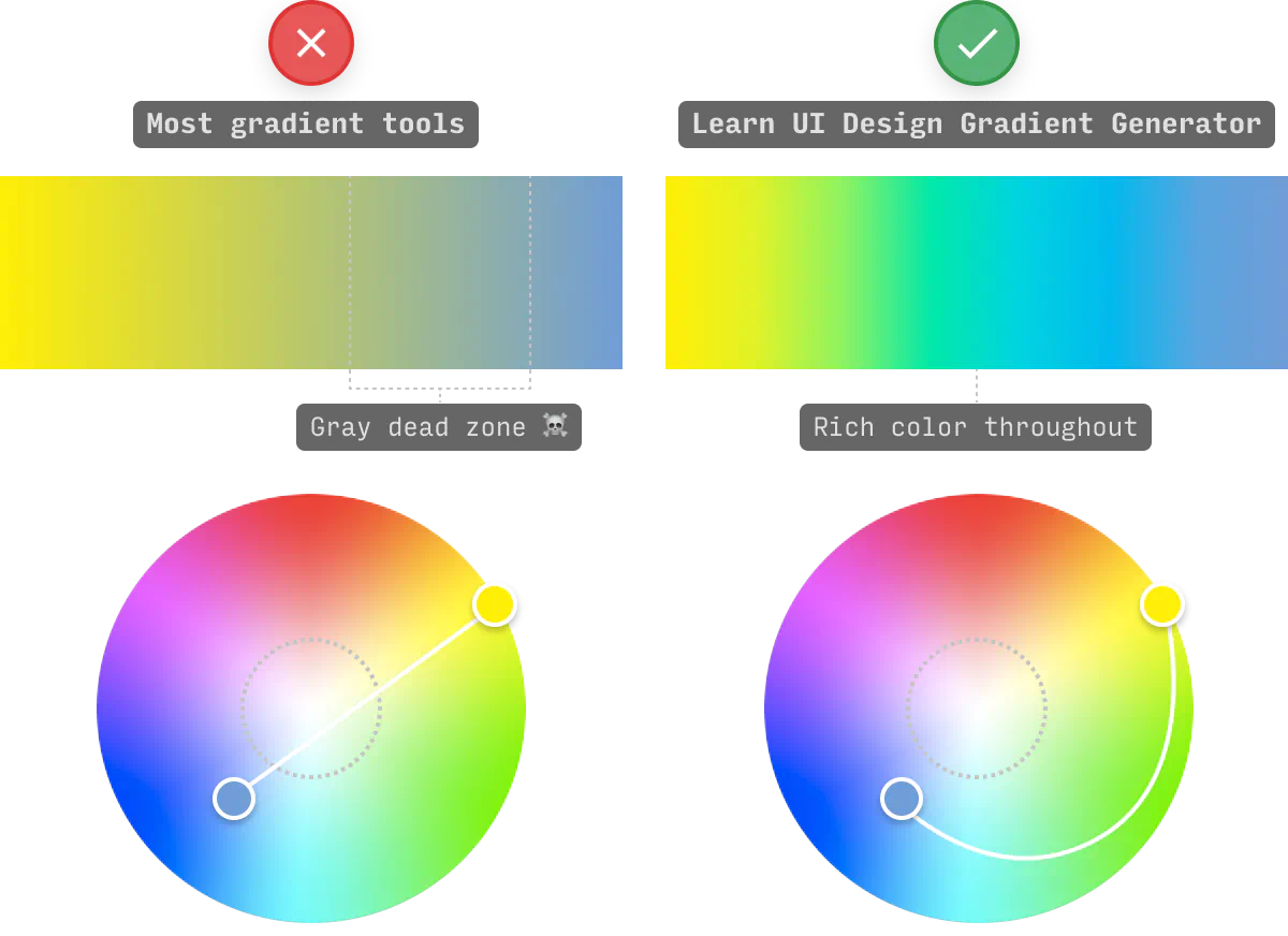
);Notice the gray, muddy color as the colors transition from yellow to purple to blue? Gradients interpolate between color stops, and by default they do it in sRGB color space. The "straight line" between two colors in RGB space doesn't radially follow the color wheel. It just cuts through the middle, where saturation is low. This is what causes the gray-ness.
 Source:
learnui.design
Source:
learnui.design
The fix is in oklch -- a relatively new color space that represents hue as an angle. Interpolating in OKLCH means blue to
purple goes through blue-purple instead of through gray.
You can see the difference just this keyword has on this same gradient in this example below.
In my experience, Claude loves gradients. One thing I like to add to my prompts or CLAUDE.md file is something like
Always use OKLCH instead of the sRGB color space. to keep the gradients looking smooth.
2. Color notes from a new perspective
Okay, part 1 was me wearing my "engineering" hat, but now I'll put on my product designer hat. The gradient presumably exists to communicate something like "this card could be for any of our categories." It's trying to communicate a message using a color signal.
The "engineering" fix doesn't really capture the original design intent. We have a smoother gradient, but it's lost the core meaning because we've introduced a bunch of other colors that detract from the 4-color gradient. So, what about discrete wedges with no blending between them?
There's one more nit here. And this applies to Connections and 4x3. Both violate one of the rules of color online, which is that color is not supposed to be the sole carrier of semantic meaning.
"People with partial sight often experience limited color vision, and many older users do not see color well. In addition, people using limited-color or monochrome displays and browsers will be unable to access information that is presented only in color."
This has a pretty quick fix, in this case, just adding a little text tag indicating the difficulty of each section. I mocked up a demo of what that could look like.
3. While we're talking accessibility
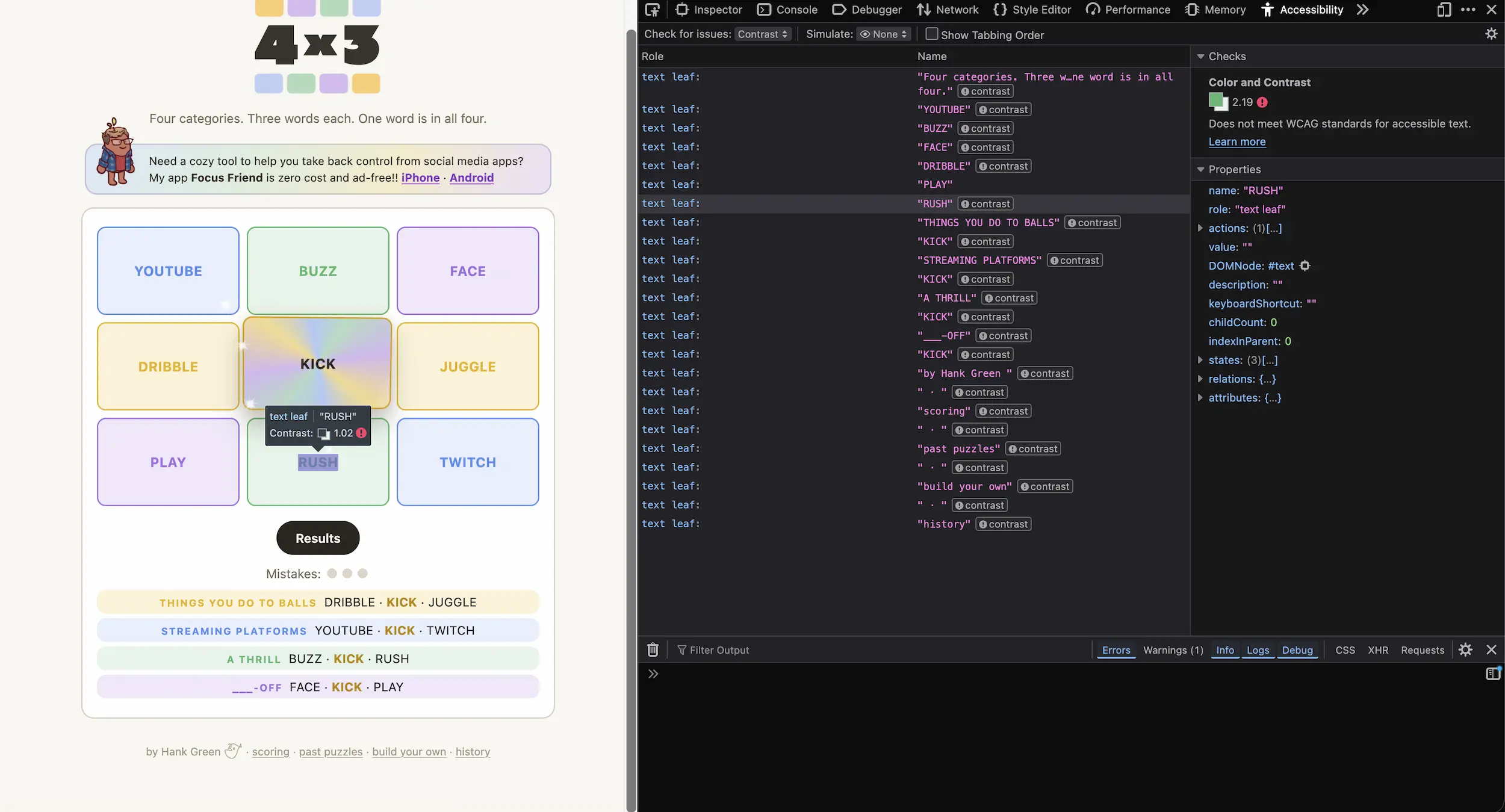
The category labels on the cards use semi-transparent text over pastel backgrounds. Pastels look light, and it's not meeting the minimum contrast levels for the web.
WCAG AA requires 4.5:1 for normal text. Every card fails with the semi-transparent text, but the fix is easy. Black text!
And the more sustainable fix moving forward is two-fold. First, there are tools built into browsers to test for accessibility challenges. In this case, in the Firefox accessibility tools, it flagged all these elements for failing to meet minimum contrast levels.
Second, there are great skills out there that you can add to Claude, or whatever AI tool you prefer. Here's one I found that seems to acknowledge all of these nits.
These are all small things that can make a big difference. Now that code is so much cheaper to write, it feels more important than ever to communicate the things that you may not even know to ask for.